NeQter Labs User Manual
Table of Contents
Dashboards
The Dashboards tab is where you are able to get information about your network easily and quickly, it is represented by a icon that looks like a group of windows. Here is where you can find visualizations that are available to help you find and digest information collected by your NeQter Client.
Generating Dashboards
When initially entering the Dashboard Tab it will only have the Health & Server Metrics Dashboards enabled. To have other dashboards enabled you will need to go to Settings > Dashboard in order to enable the dashboards you want presented, you can find out more on not only how to enable said dashboards but what each dashboard roughly covers in our Dashboard Settings page!
Once the dashboards you want active are enabled, you should be able to now see them on your Dashboard Page. This listing is where you can navigate to different dashboards. Each Dashboard page will have different types of visualizations that are available for you to look through and filter.
Viewing your Data
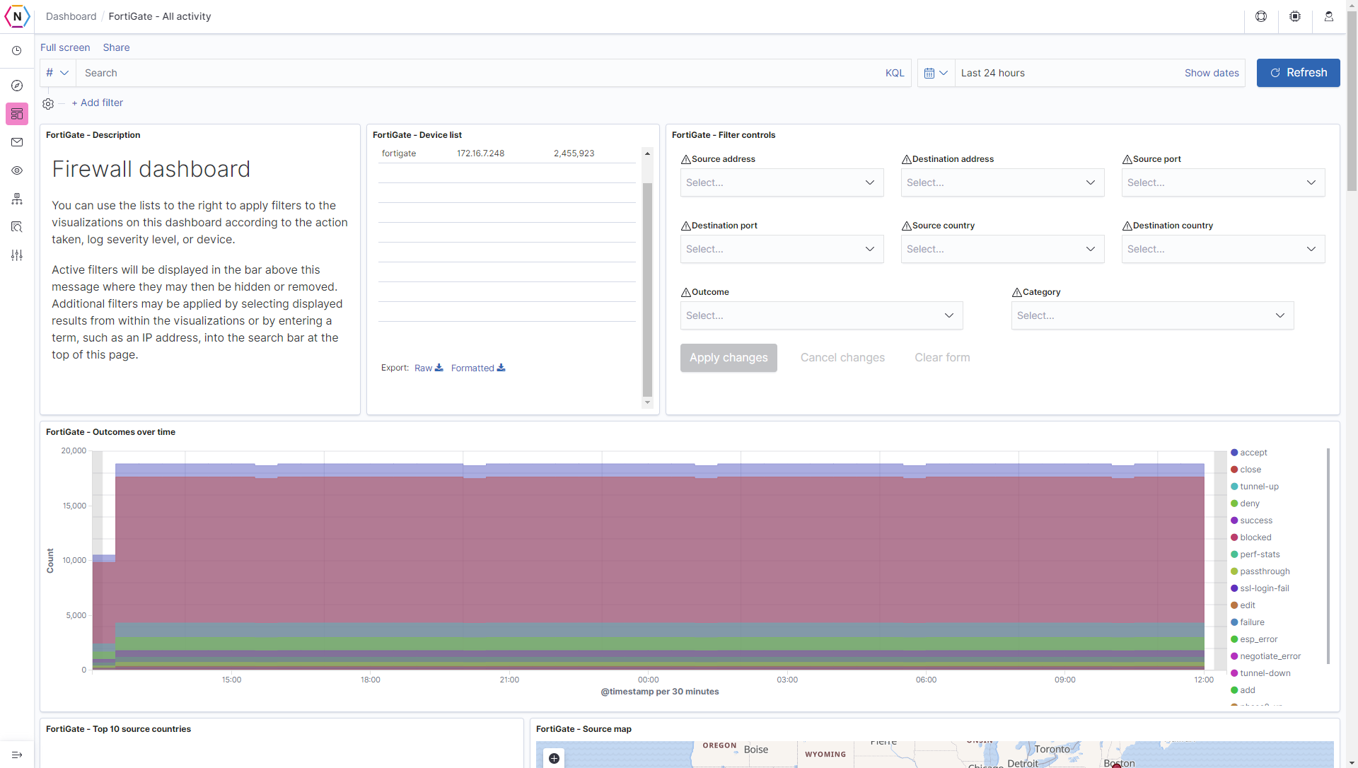
Each dashboard will be relatively similar in layout, on the top of the screen you will see a few different options such as Full Screen, Auto refresh, etc. The Update Button on the top right will allow you to update the information presented on the page to the latest findings, you can also choose the range of Time you wish to have information presented from by clicking the top right button with an amount of time, by default it should be Last 24 hours.
One of the main features of the Dashboard page however is the many colorful and helpful diagrams which are available to help show information in a more easy to digest manor. Below is a quick show of the different types of visualizations utilized by Dashboards.
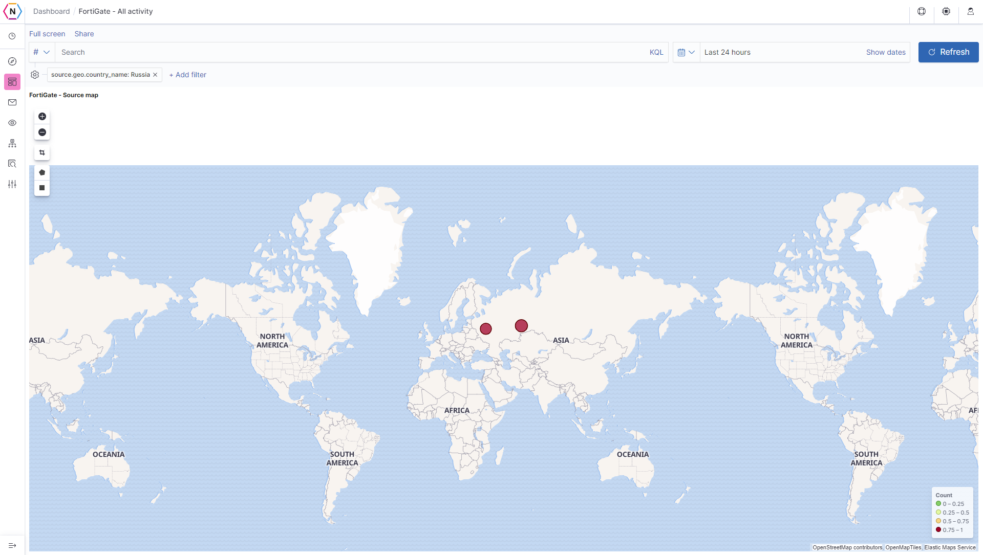
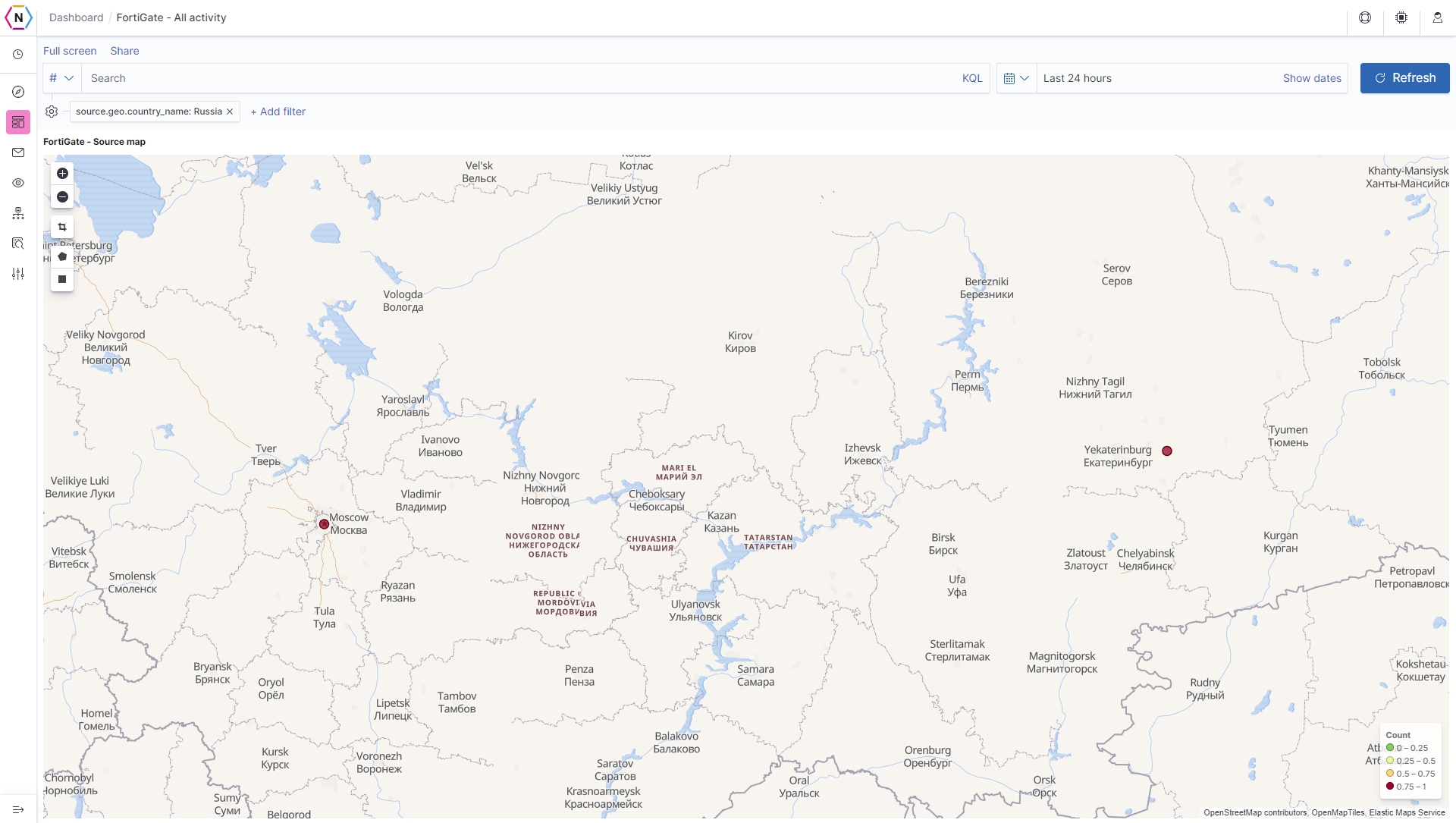
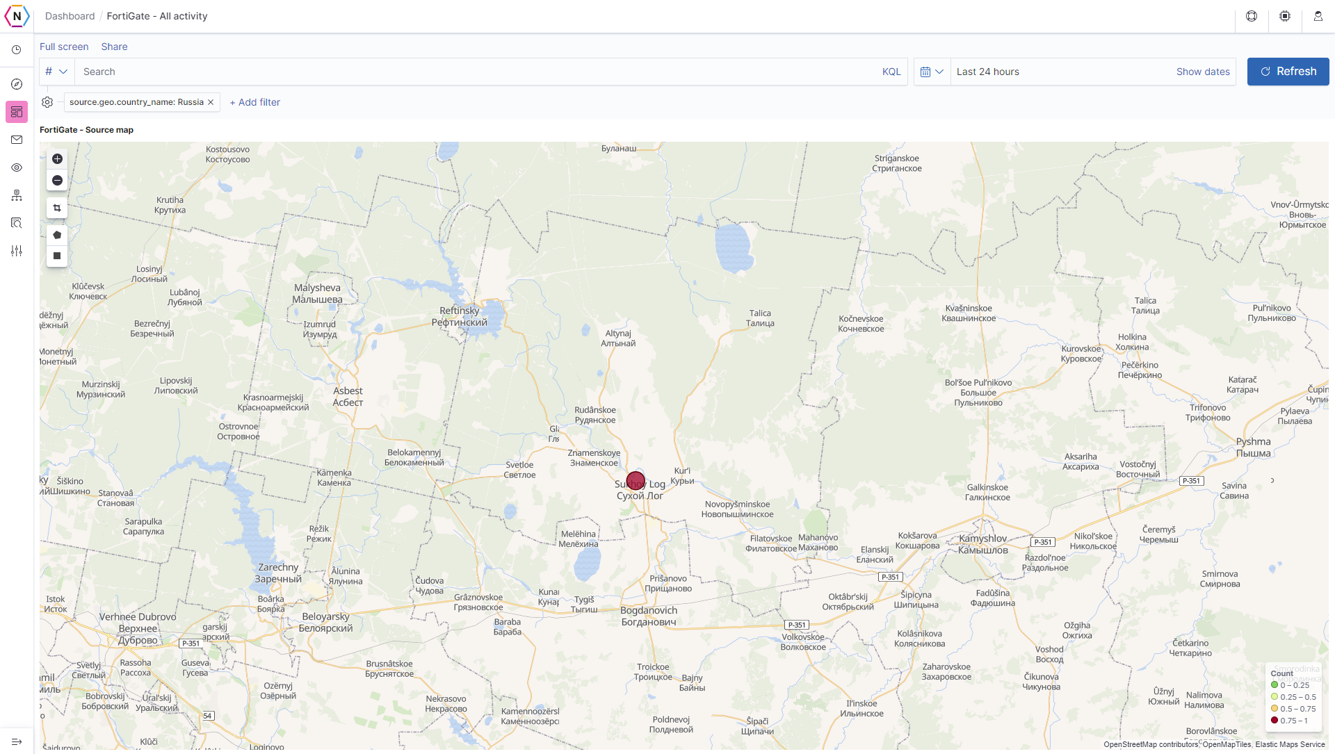
Geolocation Map Visualization
Most dashboards will have a Geolocation Map for use in order to get a better visualization of where IP Addresses that are interacting with your network can be found. These maps also try to pinpoint to as close as possible exactly where in said nations where exactly the IP Address originated from.
For example, an IP Address with origins from Russia can be further pinpointed to two specific city in Russia, in the example images below you can see that the geolocation feature can go down quite a few levels in order to give you a good idea where exactly in any country hits are originating from.
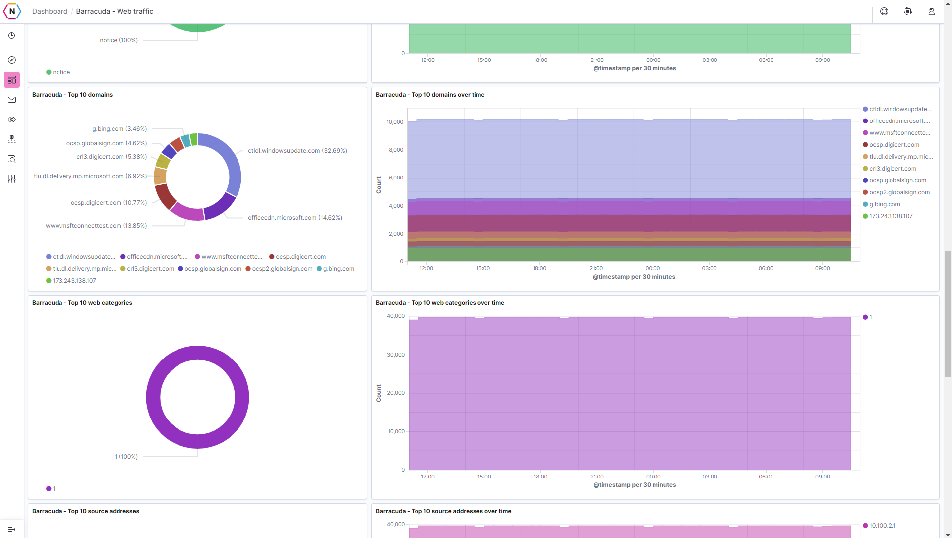
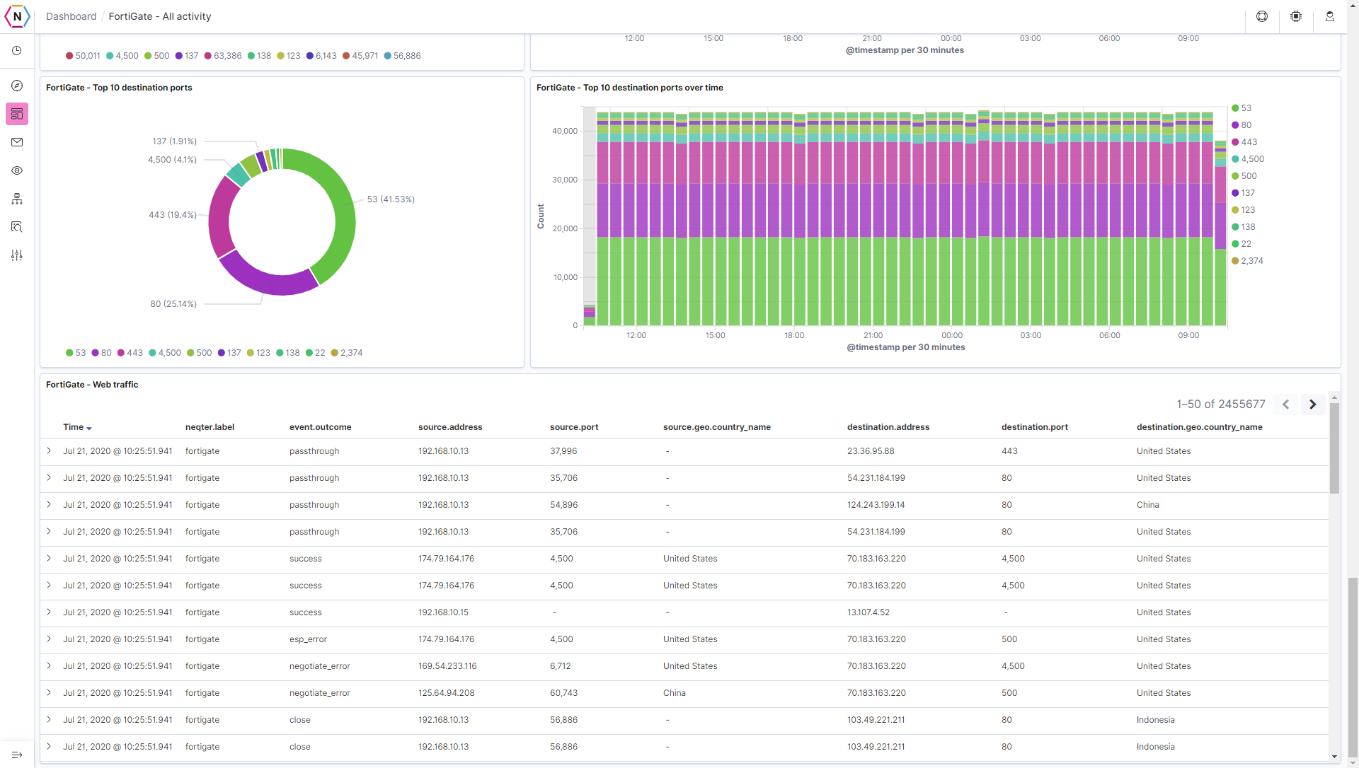
Diagrams, Charts & Listings
The most common way to help show the data collected by your system is the use of Diagrams and Charts, which can help you get a better understanding of who is interacting with your network as well other information such as what is being done most commonly on your network, the type of information going in and out of your network etc. Every Diagram / Chart is interactive and can be used to help filter information as well, simply click on the value of any given diagram, chart or listing and a filter will be made.
Finally, Raw Logs can be combed through directly from dashboards via the log listing at the bottom of each and every dashboard, here you are able to do filter and see more specific information about each and every log recorded on your NeQter Appliance.
Filtering Data & Creating Searches
Instead of having to comb through tens of thousands of raw logs in order to find relevant information you need, Kibana allows you to set Filters and specific queries to narrow down the amount of data you have to look at. Not only does Kibana allow you to easily go through information, but it also allows you to do it through multiple different ways, giving you more freedom as to how you wish to tackle different searches.
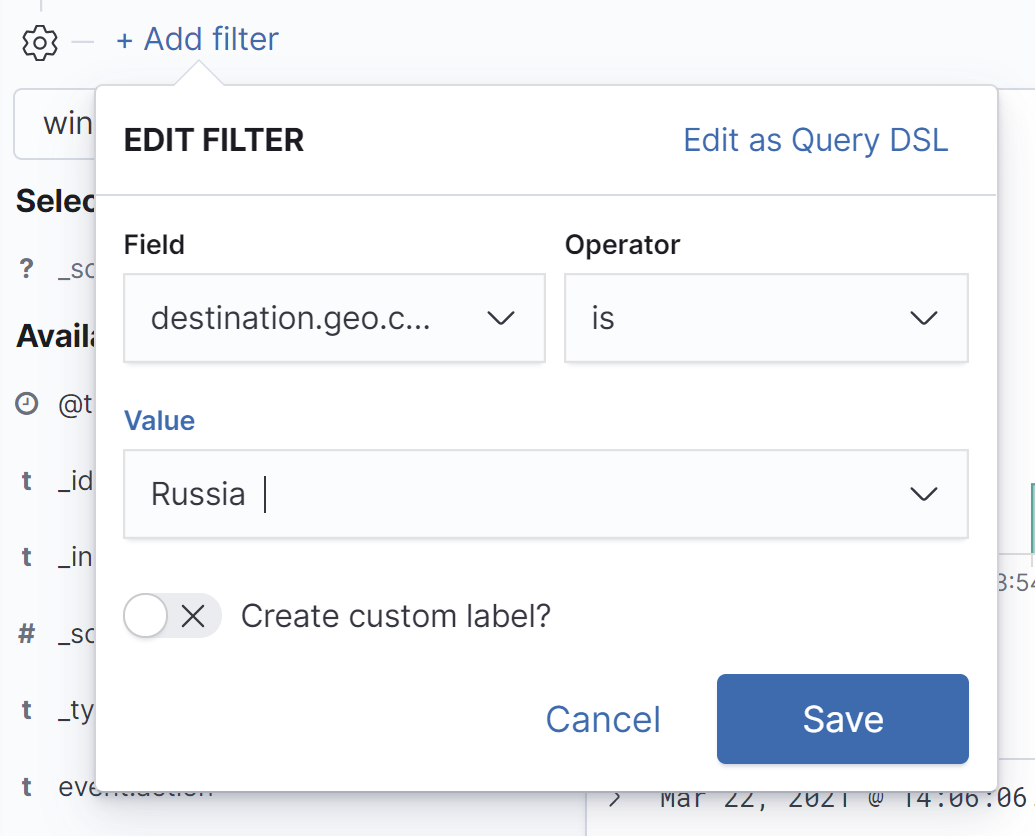
Filters allow you to select specific fields for the logs you’ve collected to be filtered by which you can use to narrow down the amount of logs being looked at. This means you can turn upwards of millions of logs down to something more manageable as a couple of hundred or even as small as a dozen or so instead for you or an auditor to sift through.
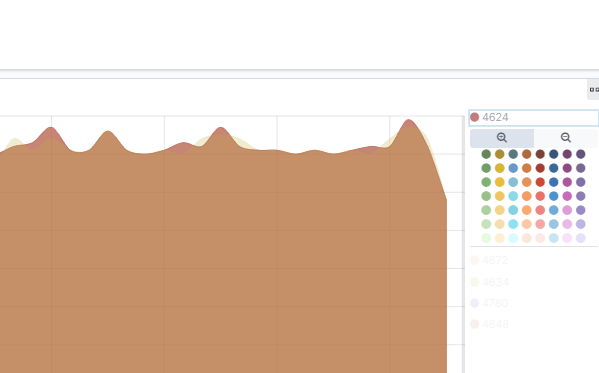
You can also create filters on the dashboard page by using the visualizations to create filters instead with there being two different methods to do so. The first method being used is if the visualization has no section where all the values corresponding to that visualization are located. If the visualization matches the previous description then you can simply click on the different color coded portions of the visualization to create a Is filter. he visualization is as follows:
The other method you are able to use for Visualizations that do have a section for values used to populate t
1. Click on the value you’d like filtered.
2. Select to either filter for or filter out that specified value.
Another way to search through logs is by creating Searches using either Lucene or KQL Language on the top search bar found under discover. You can also combine searches with filters to better sort through your raw log data.
