NeQter Labs User Manual
Table of Contents
Packetbeat Dashboard Guide
This guide will be a row by row explanation of each of the packet inspection dashboards. The goal of this guide is to help you understand what each of the graph represents for the specified dashboards. From this point on, the graphs on these dashboards will typically be referred to as visualizations and if you need assistance with navigating any dashboards not mentioned on this page you can check out our documentation Here for more information.
Types of graphs we are using
Maps
The NeQter appliance can take a public IP address and use it to discover its relative latitude and longitude. NeQter place maps on our dashboards for the purpose of showing you relatively where an event has taken place. Internal IP addresses are not able to be resolved to a location.
Numerical chart
These give an exact count of the number of occurrences of an event in the currently defined time range.Example: The number of failed Windows logins
Example on the dashboards: Row 2 of the DNS and DHCP dashboard
Pie chart
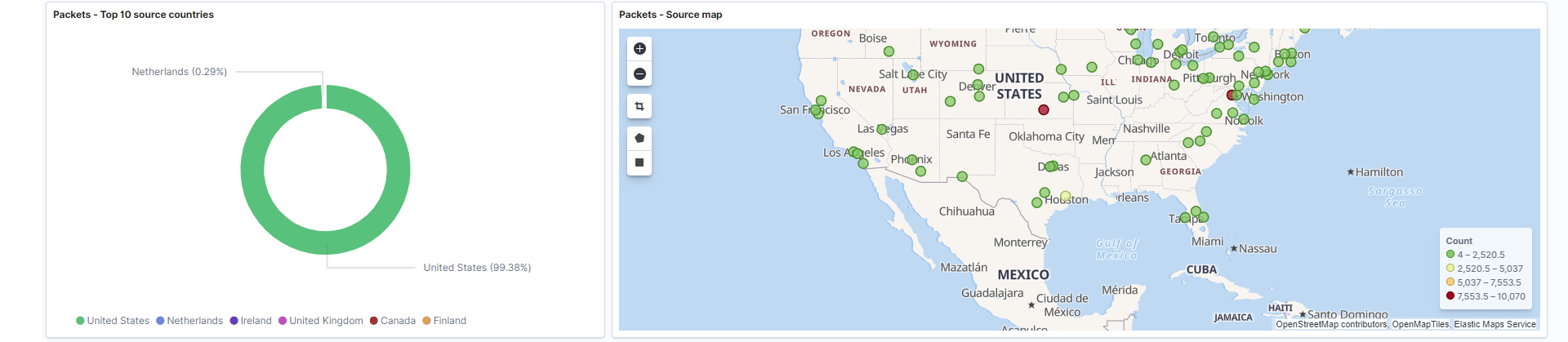
A pie chart is a circular graphic, which is divided into slices to illustrate numerical proportions. Pie charts are found on the left side of most rows in the packet inspection dashboards.Example: Row 3 of the Overview dashboard reports the top source countries, with 94+% of the logs coming from the United States, and 4% coming from France, and numerous other countries making up the last 2%.
Area chart
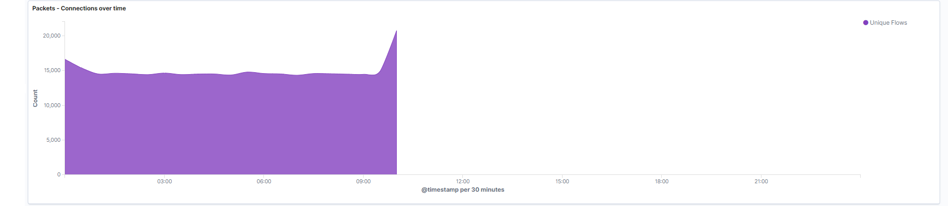
An area chart combines the line chart and bar chart to show a value change over time. The X-Axis is a set of time intervals generated automatically based on your time range, whereas the Y-Axis is the count of all the values in each time interval. You can see the generated time interval at the bottom of each chart.Example: Row 10 on the overview dashboard shows between 15,000 and 20,000 connections over the course of about 10 hours.
Stacked area chart
This is just like an area chart, except with multiple types of data stacked on each other. This is intended to be read as an area chart, except stacking the data provides the benefit of patterns. The X-Axis is a set of time intervals generated automatically based on your time range, whereas the Y-Axis is the count of all the values in each time interval. You can see the generated time interval at the bottom of each chart.Example: Row 6’s over time stacked area chart shows the status of DNS requests changing and reporting a spike of requests towards 10 AM. The requests show there are significantly more “OK” responses vs. “Error” responses.
Overlapping area histogram
Overlapping area histograms provide similar data to a typical area chart. Since the Y-Axis data overlaps, trends and patterns reveal themselves that otherwise can’t be identified through stacked or normal area charts. The X-Axis is generated as sets of time intervals automatically based on your time range, whereas the Y-Axis is the count of each of the values in the time interval laid on top of each other. You can see the generated time interval at the bottom of each chart.Example: Row 3 of the HTTP and TLS dashboard shows an overlapping area histogram representing the top HTTP domains and their count/frequency at any given time.
Bar chart
A bar chart graph which presents categorical data with bars with heights or lengths proportional to the values that they represent. NeQter use bar charts as “over time” visualizations. The X-Axis is generated as sets of time intervals automatically based on your time range, whereas the Y-Axis is the count of all the values in each of the time intervals. You can see the generated time interval at the bottom of each chart.Example: Row 2 of the HTTP and TLS dashboard, where NeQter can see a distinct pattern of HTTP transactions occurring over the last 24 hours.
Stacked bar chart
The stacked bar chart extends the standard bar chart from looking at values across one categorical variable to two. Since it’s stacked data, the intent is to identify patterns across your logs. The X-Axis is generated automatically based on your time range, whereas the Y-Axis is the count of all the values in the time interval. You can see the generated time interval at the bottom of each chart.Example: Row 4 of the overview dashboard, representing numerous source ports over time
Tag cloud
Tag clouds are a modern way of representing the frequency distribution of keywords in a set of data. The largest keywords are the most frequently occurring.Example: Row 8 of the HTTP TLS dashboard uses a tag cloud to visualize the frequency of particular TLS servers.
Table
NeQter use tables to provide raw data to the user. Tables are typically used to embed traffic inspection (like you use on the “Discover” tab) directly into the dashboard. It gives you a glimpse into the logs for the time period you’ve selected.Example: The bottom row of any dashboard contains a table for traffic inspection.
Important notes:
-
NeQter are able to resolve locations (latitude + longitude) through public IP addresses, but internal (private) IP addresses will not be resolved to a location.
-
Many of our charts are listed as “top 10” count lists, unless there are less than 10 possible items (example: pie charts that have the possible conditions of true or false will not be titled as top 10). This is done to reduce noise in the visualizations.
Overview Dashboard
This dashboard displays logs and information gathered from any log identified as packet inspection traffic. Below are the type of graphs used in this dashboard.
Types of graphs on this dashboard
- Pie chart
- Maps
- Table
- Area chart
- Stacked area chart
- Stacked bar chart
Below is a list of all the different visualizations utilized by this dashboard:
-
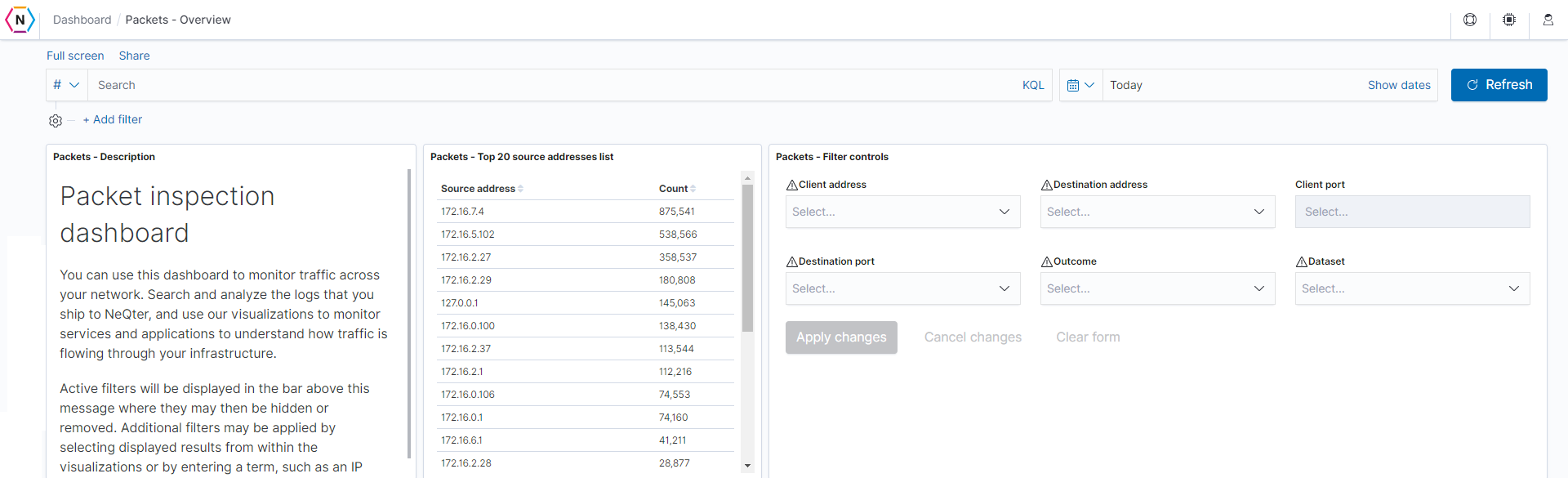
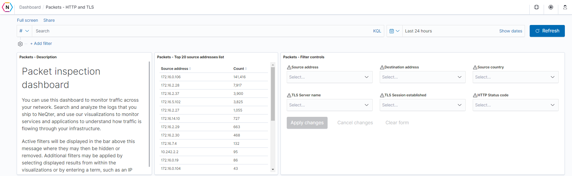
Description: This is a simple, high level explanation of the packet inspection dashboards, along with some information about filtering.
-
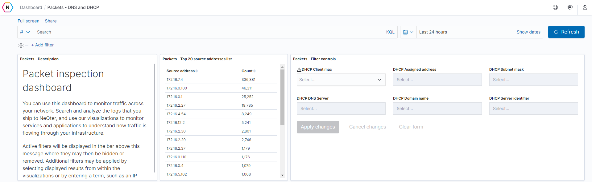
Source addresses list: The top 20 source addresses across the packet inspection index will be listed in descending order. Field: source.ip
-
Filter controls: Prevalent fields for the overview dashboard will be here for easy filtering.
-
Source countries: The top 10 countries resolved from the source addresses.
Field: source.geo.country_name -
Source map: Geographically represents the location of the top source addresses.
Field: source.geo.location
-
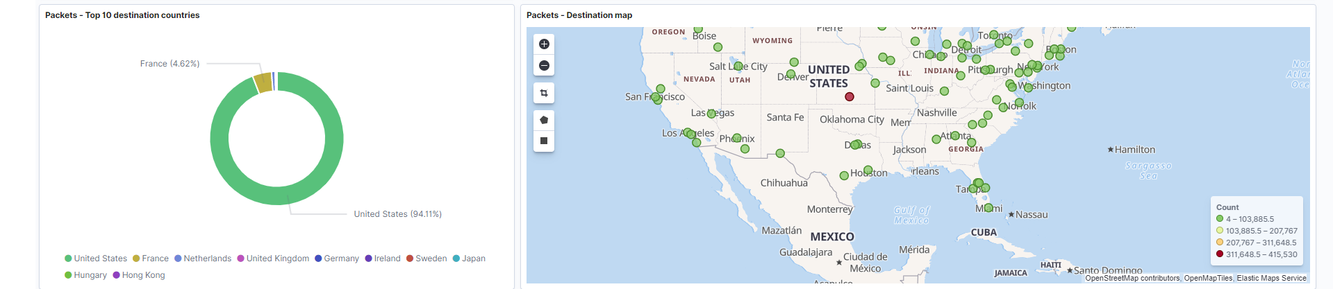
Destination countries: The top 10 countries resolved from the destination addresses.
Field: destination.geo.country_name -
Destination map: Geographically represents the location of the top destination addresses.
Field: destination.geo.location
-
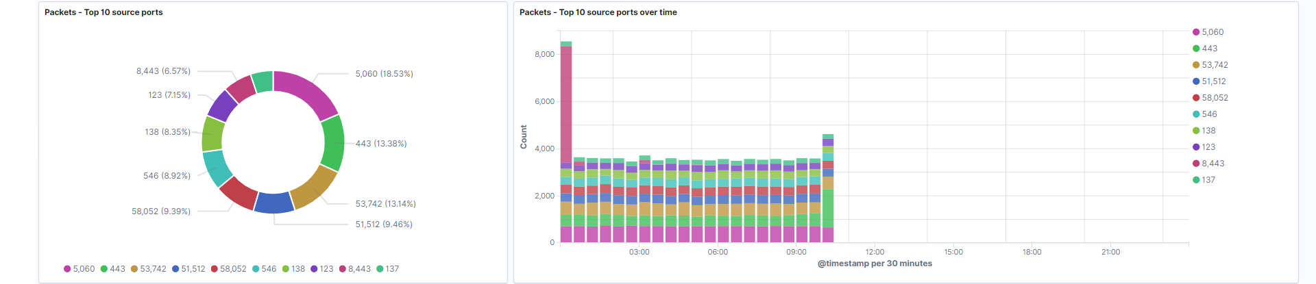
Source ports: The top 10 source ports.
Field: source.port -
Source ports over time: Represents the frequency of each port from source fields over the course of the time filter selected.
Field: source.port
-
Destination ports: The top 10 destination ports.
Field: destination.port -
Destination ports over time: Represents the frequency of each port from destination fields over the course of the time filter selected.
Field: destination.port

-
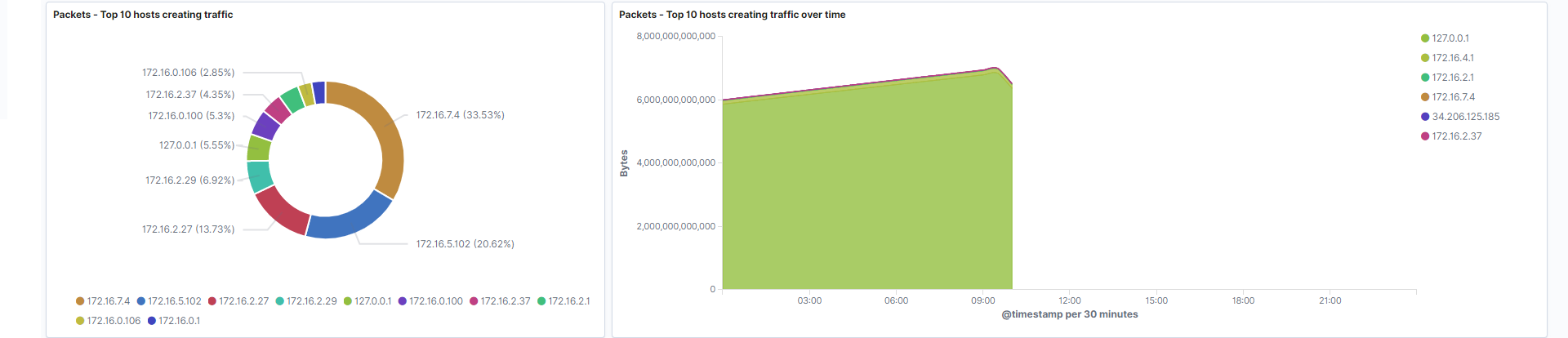
Hosts creating traffic: Represents the hosts which are generating the highest amount of traffic by count.
Field: source.ip -
Hosts creating traffic over time: Hosts that generate the highest amount of bytes over your filtered period of time. This gives you the opportunity to identify patterns associated with host traffic.
Fields: source.ip, source.bytes
-
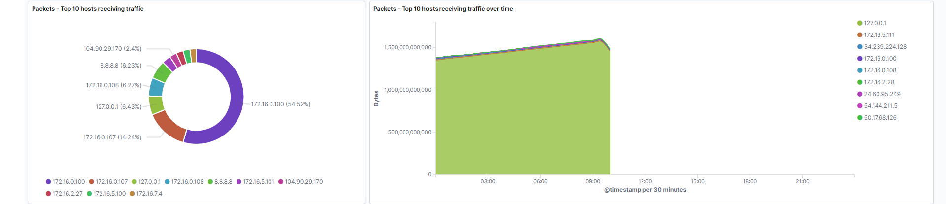
Hosts receiving traffic: Represents the hosts which are receiving the highest amount of traffic by count.
Field: destination.ip -
Hosts receiving traffic over time: Hosts that receive the highest amount of bytes over your filtered period of time. This gives you the opportunity to identify patterns associated with host traffic.
Fields: destination.ip, destination.bytes
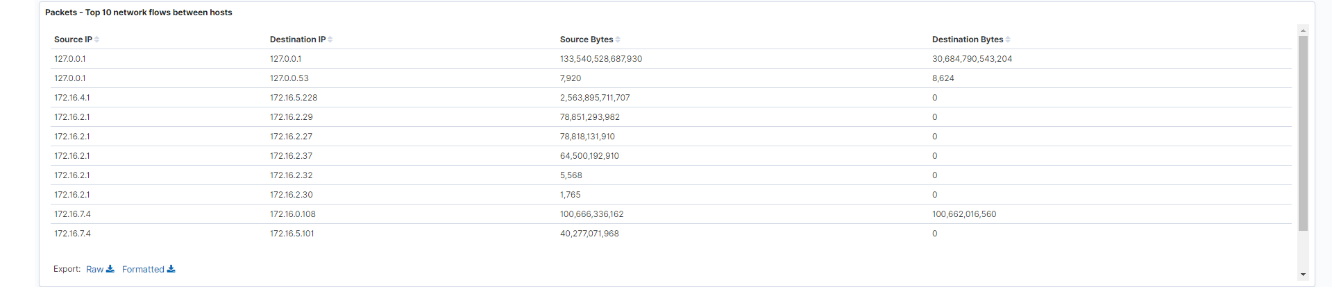
- Network flows between hosts: Data flow between source and destination addresses, including columns showing the source and destination byte counts. The number of bytes can be used to determine the exact numerical flow of data across your devices.
Fields: source.bytes, destination.bytes, source.ip, destination.ip
-
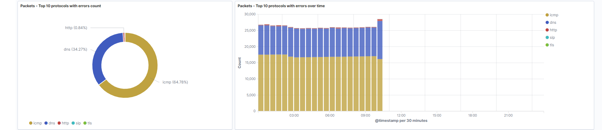
Protocols with errors count: The protocols reporting the highest number of errors. This data correlates to the data displayed on row 11. In the example, we see that ICMP is reporting the highest number of errors.
Field: event.dataset -
Protocols with errors count over time: The protocols reporting the most errors at a given time. In the example, the first three hours of the day shows a slightly higher number of errors connected to ICMP, whereas DNS errors increase around 10 AM.
Field: event.dataset
- Connections over time: Represents the total number of unique flows occurring on your network at any given time. Flows are connections that NeQter have assigned a flow id, and each flow id represents one unique connection.
Field: flow.id
-
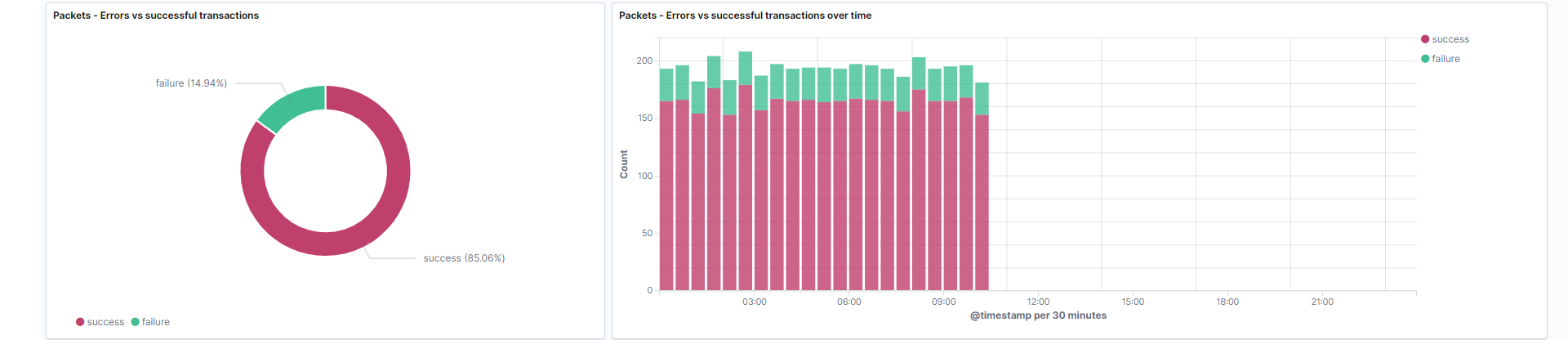
Errors vs. successful transactions: The number of successful and unsuccessful connections. Unauthorized connections can be further investigated using the event.reason field. This visualization is a filtered visualization that is only looking at traffic that has the event.dataset field equal to ‘flow’.
Field: event.outcome -
Errors vs. successful transactions over time: This displays the values in the event.outcome field over time using an stacked bar histogram.
Field: event.outcome
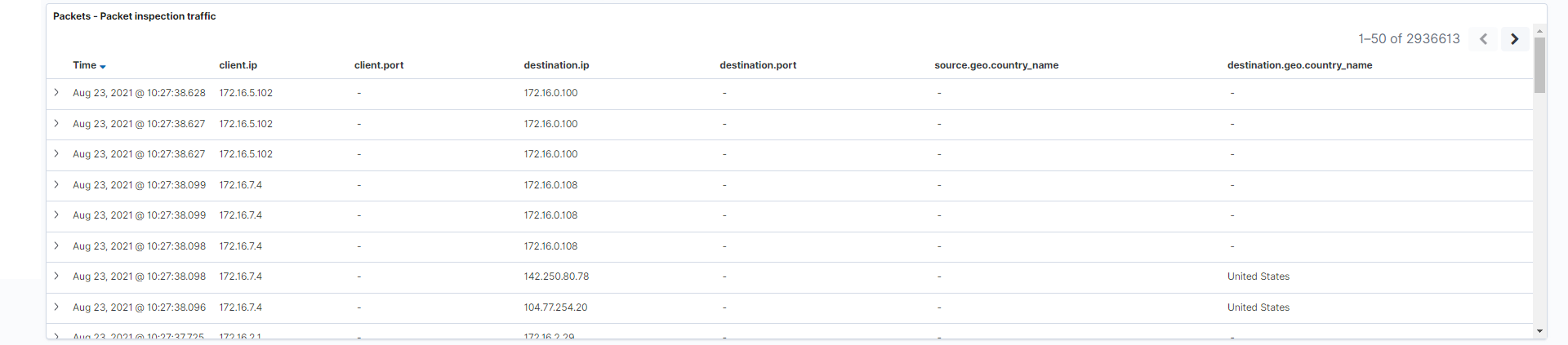
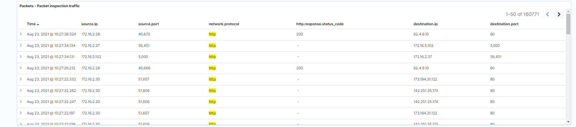
- Packet inspection traffic: Representation of the actual logs themselves. Think of this as an embedded “discover” table that displays the logs in the current time frame from newest to oldest.
Fields: client.ip, client.port, destination.ip, destination.port, source.geo.country_name, destination.geo.country_name
HTTP / TLS Dashboard
This dashboard displays logs and information gathered from packet inspection traffic which has been identified as HTTP or TLS data.
Types of graphs on this dashboard
- Pie chart
- Bar chart
- Numerical
- Table
- Overlapping area histogram
- Stacked bar chart
- Tag cloud
Below is a list of all the different visualizations utilized by this dashboard:
-
Description: This is a simple, high level explanation of the packet inspection dashboards, along with some information about filtering.
-
Source addresses list: The top 20 source addresses associated with HTTP / TLS across the packet inspection index will be listed in descending order.
Field: source.ip -
Filter controls: Prevalent fields for the HTTP / TLS dashboard will be here for easy filtering.
-
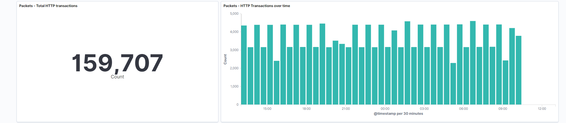
Total HTTP transactions: An HTTP transaction contains a request and response. This transaction begins as the client sending the request to the server, then the server responding to the client. This visualization is a numerical value which represents the amount of unique transactions that have occurred.
Field: network.protocol -
Total HTTP transactions over time: Bar chart which represents how many unique transactions are occurring at a given time.
Field: network.protocol
-
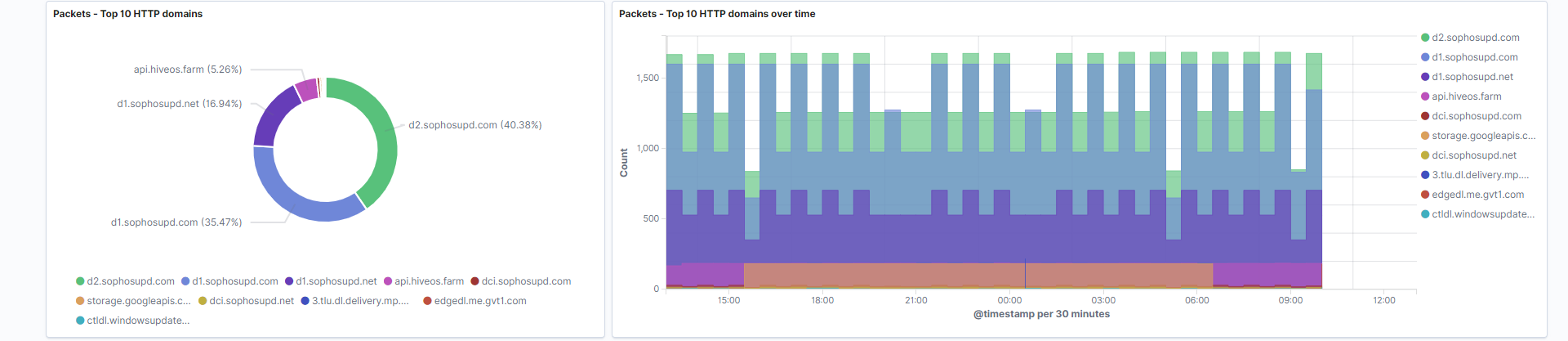
Top 10 HTTP domains: A pie chart containing the top 10 domains that show up in your HTTP logs. In specific circumstances this field may be an IP address rather than a domain name.
Field: url.domain -
Top 10 HTTP domains over time: Stacked bar chart that indicates the count of domains at a given time.
Field: url.domain
-
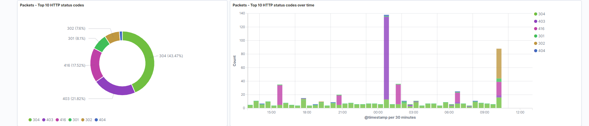
Top 10 HTTP status codes: Transactions which report a status code do it in both normal and error conditions. This can range anywhere from an “OK” 200 response, to an “Error” 404 response. This visualization is the count of each HTTP status code, in pie chart format.
Field: http.response.status_code -
Top 10 HTTP status codes over time: The count of each HTTP status code over time, in stacked bar chart format.
Field: http.response.status_code
-
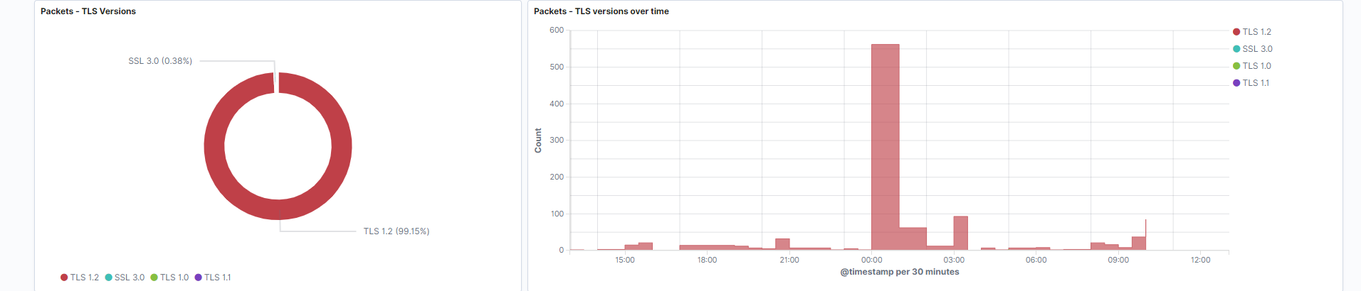
TLS Versions: TLS protocol versions, which are the successor for SSL. SSL Versions 1.0, 2.0, and 3.0 will also be graphed. This data gives you a glimpse at which cryptographic security protocol versions are communicating across your network. The current TLS versions that exist are TLS 1.0, 1.1, 1.2, and 1.3.
Field: tls.detailed.version -
TLS Versions over time: TLS protocol versions measured over time.
Field: tls.detailed.version
-
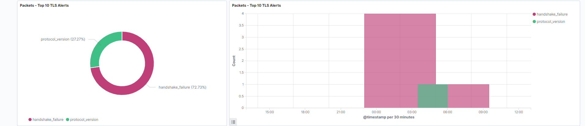
Top 10 TLS alerts: Represents the highest frequency TLS alerts. An alert is returned in both normal and error conditions. Common alerts include a handshake failure, or a TLS version.
Field: tls.detailed.alert_types -
Top 10 TLS alerts over time: Shows the frequency of alerts at a given time, in overlapping area histogram format.
Field: tls.detailed.alert_types
-
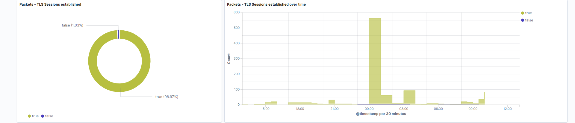
TLS Sessions established: Pie chart which represents the boolean value of whether TLS sessions were successfully established.
Field: tls.established -
TLS Sessions established over time: Overlapping area histogram which tracks the results of TLS sessions over time. This particular graph draws patterns without clutter since it has only 2 values to visualize.
Field: tls.established
-
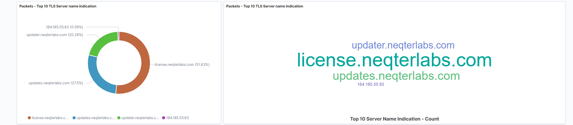
Top 10 TLS Server names: The TLS server is the hostname that the client is attempting to connect to.
Field: tls.client.server_name -
Top 10 TLS Server names over time: The frequency of hostnames over time, represented in tag cloud format.
Field: tls.client.server_name
- Packet inspection traffic: This is a tabular representation of the actual HTTP and TLS logs themselves. Think of this as an embedded “discover” visualization which allows you to see logs without navigating away from the dashboard.
fields: source.ip, source.port, network.protocol, http.response.status_code, destination.ip, destination.port
DNS / DHCP Dashboard
This dashboard displays logs and information gathered from packet inspection traffic which has been identified as DNS or DHCP traffic.
Types of graphs on this dashboard
- Numerical
- Pie chart
- Bar chart
- Table
- Stacked area chart
- Stacked bar chart
Below is a list of all the different visualizations utilized by this dashboard:
-
Description: This is a simple, high level explanation of the packet inspection dashboards, along with some information about filtering.
-
Source addresses list: The top 20 source addresses associated with DNS or DHCP events. These will be listed by count in descending order.
Field: source.ip -
Filter controls: Prevalent fields for the DNS / DHCP dashboard will be here for easy filtering.
-
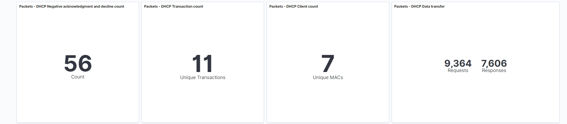
DHCP Negative acknowledgement and decline count: This visualization is looking for DHCP events where the server’s response is either NAK (negative acknowledgement) or decline. Negative acknowledgement (NAK) occur when your DHCP server receives a request for an IP address that is invalid for its configuration. It may also send a NAK message if there are no more addresses available in the pool. DHCP decline messages occur when the client determines the servers configuration parameters are different, invalid, or showing an IP address already in use.
This visualization tracks and counts these events numerically.
Field: event.dataset
Search: This visualization is only looking at traffic where the fieldevent.datasetis equal todhcpv4. -
DHCP Transaction count: DHCP transactions occur based on your internally configured DHCP settings. Typically, a DHCP lease lasts 24 hours, and then it will renew. This visualization tracks and counts these events numerically.
Field: dhcpv4.transaction_id
Search: This visualization is only looking at traffic where the fieldevent.datasetis equal todhcpv4. -
DHCP Client count: Each DHCP Client is given a unique MAC address to identify that device. These events are reported by system logs, and can be used to correlate events to a specific device.
This visualization tracks and counts each client numerically.
Field: dhcpv4.client_mac
Search: This visualization is only looking at traffic where the fieldevent.datasetis equal todhcpv4. -
DHCP Data transfer: NeQter logs the transactions between clients and DHCP servers.
This visualization tracks and counts the transfer of data between these devices numerically, in bytes.
Requests = client
Responses = server
Field: client.bytes, server.bytes
Search: This visualization is only looking at traffic where the fieldevent.datasetis equal todhcpv4.
-
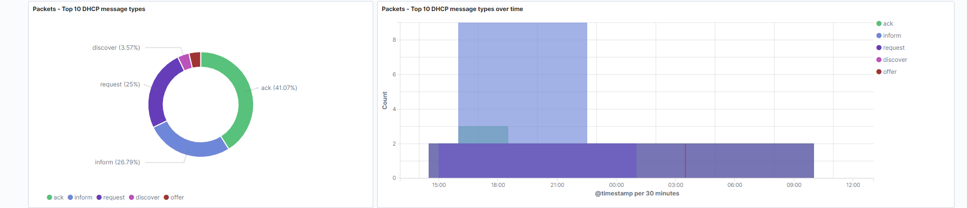
Top 10 DHCP message types: DHCP messages occur in both normal and error conditions. Examples include release, NAK, decline, and discover messages.
Field: dhcpv4.option.message_type
Search: This visualization is only looking at traffic where the fieldevent.datasetis equal todhcpv4. -
Top 10 DHCP message types over time: DHCP messages over time, in overlapping area histogram format. This visualization is helpful for identifying patterns.
Field: dhcpv4.option.message_type
Search: This visualization is only looking at traffic where the fieldevent.datasetis equal todhcpv4.
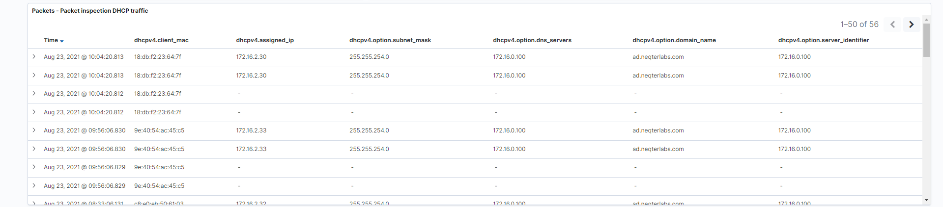
- Packet inspection DHCP traffic: This is a tabular representation of the DHCP traffic. Think of this as an embedded “discover” visualization which allows you to see logs without navigating away from the dashboard.
Fields: dhcpv4.client_mac, dhcpv4.assigned_ip, dhcpv4.option.subnet_mask, dhcpv4.option.dns_servers, dhcpv4.option.domain_name, dhcpv4.option.server_identifier
Search: This visualization is only looking at traffic where the fieldevent.datasetis equal todhcpv4.
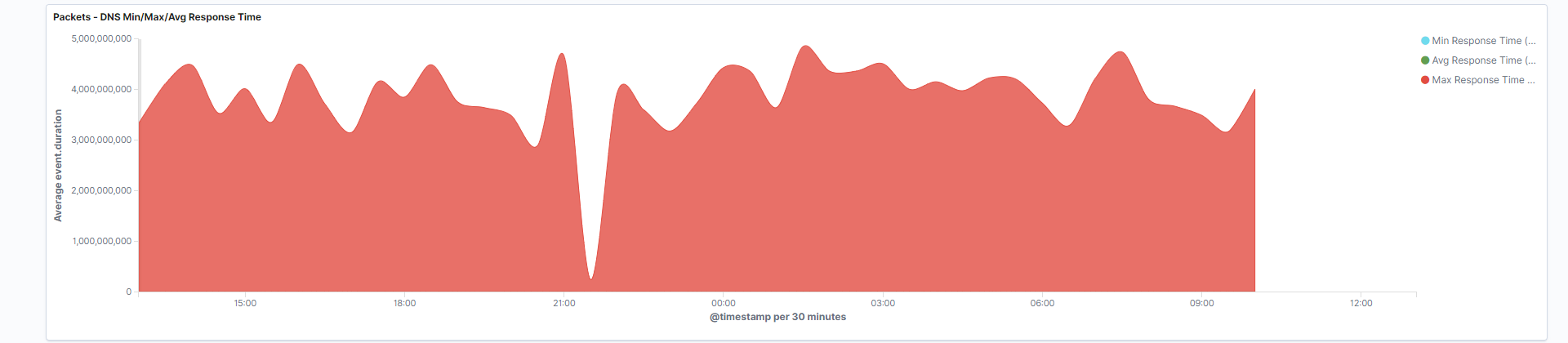
- DNS Min/Max/Avg response time: This area chart tracks the flow of DNS server response times, and visualizes the minimum, maximum, and average response times. Desirable DNS latency is approximately 20ms.
Fields: event.duration, network.protocol
Search: This visualization is only looking at traffic where the fieldnetwork.protocolis equal todns.
-
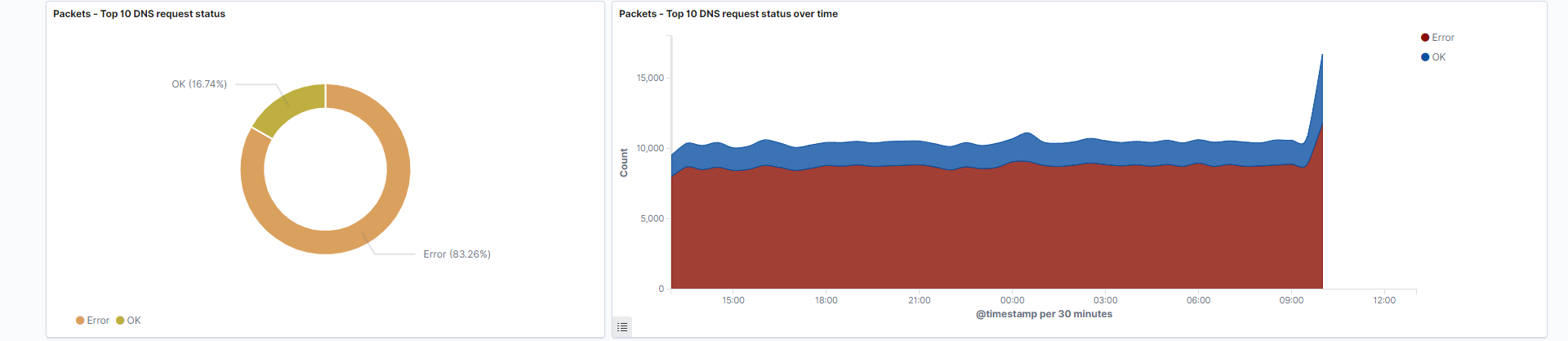
Top 10 DNS request status: DNS Queries occur when a client requests information from a server. This visualization identifies whether the DNS query is successful, or failed, and graphs that in pie chart format. You will typically see statuses such as: “Error” and “OK”.
Field: status
Search: This visualization is only looking at traffic where the fieldnetwork.protocolis equal todns. -
Top 10 DNS request status over time: Track DNS query statuses over your selected period of time.
Field: status
Search: This visualization is only looking at traffic where the fieldnetwork.protocolis equal todns.
-
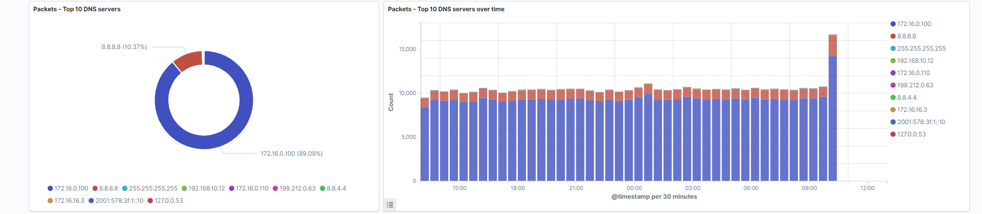
Top 10 DNS servers: DNS Servers addresses are the primary identifier and address used to determine where a request is going. These server addresses are visualized in pie chart format.
Field: destination.ip
Search: This visualization is only looking at traffic where the fieldnetwork.protocolis equal todns. -
Top 10 DNS servers over time: DNS Server addresses represented over your selected time period. Stacked bar chart format shows patterns between each DNS servers presence at a given time.
Field: destination.ip
Search: This visualization is only looking at traffic where the fieldnetwork.protocolis equal todns.
-
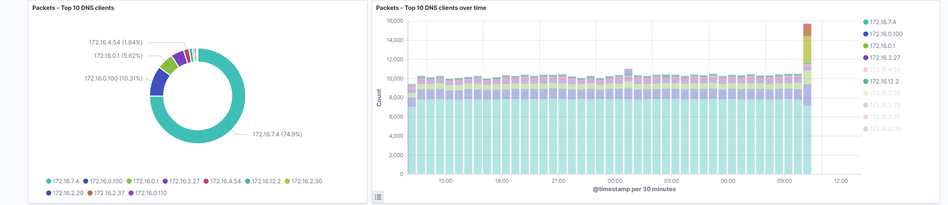
Top 10 DNS clients: DNS Client addresses are the primary identifier to determine where a request is coming from.
Field: source.ip
Search: This visualization is only looking at traffic where the fieldnetwork.protocolis equal todns. -
Top 10 DNS clients over time: DNS Client addresses are visualized over your selected time period.
Field: source.ip
Search: This visualization is only looking at traffic where the fieldnetwork.protocolis equal todns.
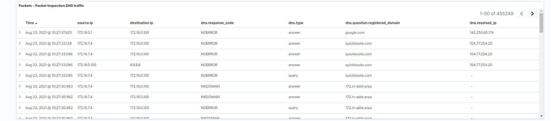
- Packet inspection DNS traffic: This is a tabular representation of the actual DNS and DHCP logs themselves. Think of this as an embedded “discovery” visualization which allows you to see logs without navigating away from the dashboard.
Fields: source.ip, destination.ip, dns.response_code, dns.type, dns.question.registered_domain, dns.resolved_ip
Search: This visualization is only looking at traffic where the fieldnetwork.protocolis equal todns.